As previously stated in my latest post, I really loved this project and the work Ive produced. I think that personally I have excelled myself on all aspects of study, from research to execution of the final pieces.
I know that I defiantly had a bit of a struggle, especially in the first couple of months of the project as although I knew the content of what I wanted to study, I wasn't sure how to develop the context to produce a professional project which would have results that reflect that. I found that mind mapping and just gathering as much research on the project content as I could. it wasn't until I really focused on the old Victorian and Edwardian photographs that I really found my inspiration and actually knew what I was doing and why.
I think I did let this knock my confidence a bit as I am usually very on the ball and know exactly what I'm doing that - saying that I think now that I have the chance to look back on it all I feel more confident because I know that as long as I keep moving, I will get he answer I'm looking for if I keep putting in the effort.
I think that the research is one of the strongest parts of my project - I looked at so much both online and in books that I gave my self a wide scope, meaning I had a lot of research to fall into and look back on in difficult situations, like looking for a context for my illustrations to be set in.
I think that my tutorials were really useful as well - due to personal circumstances I wasn't able to have as many as I wanted but I did feel that getting other's opinions and having the opportunity to keep talking about what I'm doing and why gave me more clarity for explaining to others as well as for my self personally too.
I really enjoyed the development of the background and final pieces - I think that these are probably my best final pieces yet as they have a much more complex meaning than meets the eye, there's something deeper to them under the surface and I think this is a sign that I am developing in to an illustrator with more thought in my practice than before and that I've developed this from the past research and experiments show the self development and how I have grown.
I think this project has been really successful, I would have loved to have more tutor time and more time to be around more people, as well as being able to go places for research but sadly after finally having my project Epiphany it was too late to plan anything that could have worked! Bugger!
Again, despite the set backs - I'm very happy and proud, and regardless of the mark I get the fact I can personally reflect and say that this is my best and the reasons why means that I'll sleep tonight regardless of marks in the future! (That could be down to lack of caffeine though....!)
Wednesday, 29 May 2013

La pieces de la final
For my final images I decided on the three strongest ones from my mock ups on Illustrator. Although originally I wanted my illustrations to be of women only, I really liked the image of the older couple together and really liked the way the image worked with it's quote "Everything has beauty but not everyone sees it".
As well as this I thought the age of the couple as well as the love between them made the quote more meaningful, for the project as a whole and for a beautiful illustration.
The other two images that I chose were down to the quality of the tattoos on the digital edits. I really liked all of the faces and layouts of the the other illustrations but I felt the front facing two women had a better quality of line on their tattoos, as well as showing more covering in terms of tattoos as well, which I think speaks better to the audience and to the quotes that they are working with.
Once I made my decision I printed out the images of the black illustrations and the backgrounds out on to high quality cartridge paper. I wanted to use that because I think it felt best because I could use fine liner pens for un-interrupted detail as well as using watercolour and ink washes too. I used a thicker paper so I knew that it would stand the wear or multiple layers and washes.
After this I pencil sketched out half of outlines for where I wanted the banners holding the quotes as well as the motifs. For the motifs especially I referred back to my initial research images of people with tattoos and what they had to give me some similar styled images to used of the same era for decoration on the illustrations.
Using tracing paper I then mirror flipped all of the decoration over to give balance and a humanly touch to the reflections - it may not be perfect the the exact degree and line but I think it adds more charm but having a balance with a feel of a innocent imperfections - nothing's perfect and I don't want these Illustrations to be completely regimented and forced.
Once all of this was done, I refereed back to my colour swatches and pallets and watercoloured basic block

I have to admit, I actually am really pleased with the final images and how they turned out. I plan to spray mount them onto mount board and then display them like this for show - I do not plan on using frames as I feel it will take away from the charm.


Developing Final images
Three final images: Three quotes:
Everything has beauty, but not everyone sees it.
To thine own self, be true.
Be Curious, not judgemental.
I started to create digital mock ups and back ground ready for the final pieces. I decided it would help me in decisions on presentation of the final pieces and weather to create frames for the images or not. I recreated my multiple layered images for the background as seen in past posts. This time I added more detail in with typography and added more quotes in too. As a twist on past experiments, I added cropped translucent images of the characters photographs in the background, as the ones I found online.
Below shows the two art boards of the same image, one as a original and one as a tracing, before having a sepia wash over the top.

Below it the first art board with just one layer of translucent orange sepia over the top.

Below is the two layers of sepia which I think works much better and deeper - adding more tone to the background and ready for the piece as a whole. I think the shadow fading in also works well, giving the image a clean cut look on the edges and a professional finish ready for the illustrations to go on top.

After creating my background pieces ready, I tweaked the illustrations used and scanned them into Illustrator. I wanted my images to be clean cut, similar in style to lino-cutting but digital, ready to work into further in pen and ink by hand.
Using filters and tracing options on Illustrator I created the poster style mock ups as seen below, black and white, clean cut like digital lino or wood cut prints that can be adapted ready for the final images. I really liked thesebecause they were bold and I knew that they would stand out against the background but as well as this I also felt that the tattoos worked really well too, that they can out looking like tattoos but also gave me the scope again to work into them more by hand.


After digitally altering all of the images to the same print cut effect I then worked on mocking up on the page. Using the magic wand tool I selected all of the white bits of the illustration and deleted them so they were now transparent gaps.
I copied the now black and translucent image over to the background and pasted it. I adapted the scale to the A3 setting to give myself room to work with after print out for drawing on the quotes and tattoo motifs around the illustration. I cleaned up around the scan edges and then did this all over for the other images, ready to pick my three strongest for final pieces.
Illustrations samples & the merging of projects


For my illustrations samples that I wanted to created to see if I was on the right tracks for the portraiture project I used fine liners, inks, marker pens and brush pens to create a stylized portrayal of some of the characters found within my research.
I experimented with ways to show the tattoos on the skin of the people. I experimented with colors that I initially tired in my sketch journal, blues and reds. I think both are really effective but I defiantly prefer the blue as it pays homage to old tattoos and tattoo ink that would be called black but would appear as a blurry blue instead.
As well as this I played around with covering areas of skin with marker pen in areas where I knew there were tattoos but I didn't know what exactly the tattoos were or could be. This is demonstrated in the portrait of the couple together. I think it works really well as a way of coverage and representing tattoos on the skin, as well as that I think that it also works well on the areas of the tattoos that aren't solid blue but are still colored in or shaded. I used Pro Marker pens to demon straight this.
As well as this, while reflecting on illustration samples and research so far, I found that my projects are naturally merging together and becoming one. I say this not because it's a forced idea - but the quotes I want to work with I naturally find linking to the images that I want to illustrate with - I think that together, bringing the two projects into one, I will be able to create naturally forming narratives of tattoos and the people who have them from days gone by - creating images that will be meaningful and reflective upon the subject matter and have images made with a strong sense of context and place in the world both in the past when they were set and today as well.


Creating a background
I decided I wanted to start the ball rolling in regards to experimenting on ideas that I wanted to develop ready for final pieces.
I wanted my background to have a realistic feel - with a reflection on the quotes that I really liked as well as a vintage feeling to them from colour, tone and type. Using Illustrator I created multiple layers of typography using quotes and different styles, all in black. I then added in photos and created everything into a single group/ After experimenting with layouts I added sepia over lays with blending shadows from the edges in to create vintage looking and retro inspired back ground for me to use as a basis to work on top of. I used layering's of photos on top in black and white and played with translucency to see how effective pieces were and if things blended in or stood out. For my photos I wanted them to stand out as I used them to represent my illustrations. I found that making the background more transparent meant that the lettering and background could still be seen and read but at the same time kept the photos (representing illustrations) in the foreground too.
And below, I show my working out!


I wanted my background to have a realistic feel - with a reflection on the quotes that I really liked as well as a vintage feeling to them from colour, tone and type. Using Illustrator I created multiple layers of typography using quotes and different styles, all in black. I then added in photos and created everything into a single group/ After experimenting with layouts I added sepia over lays with blending shadows from the edges in to create vintage looking and retro inspired back ground for me to use as a basis to work on top of. I used layering's of photos on top in black and white and played with translucency to see how effective pieces were and if things blended in or stood out. For my photos I wanted them to stand out as I used them to represent my illustrations. I found that making the background more transparent meant that the lettering and background could still be seen and read but at the same time kept the photos (representing illustrations) in the foreground too.
And below, I show my working out!


Week 8 - oh to be an illustrator.
From finding my appifiny pieces I started looking at vintage tattoos from the Victorian and Edwardian era and doing more research for myself such as colour swatches, small design ideas and more rough sketches.
 Left is a section of my reflective journal where I used both recent and vintage tattoo design sheets and, with the help of Adobe Illustrator, created colour charts and swatches of colours used.
I felt this was important to me as I always like to work in colour - weather it's minimal or bold, and I wanted my work to be reflective and representational or the era where I am getting my main inspiration from.
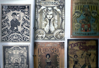
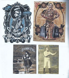
As well as that, I did further research, both with my dissertation and more visual research by looking at the placement of tattoos traditionally in the Victorian to Edwardian era. Main career choices tended to be, at the time, and this is a very big generalization, but of more lower to working class jobs, entertainment such as working in circus' as freaks and sideshows,as tattooist, grafters and military people. Although the world is no becoming more and more aware of tattoos on the upper class and royalty in Britain, I wanted to represent the working women, the beautiful, different, unique women, who, although we don't know what they did or who exactly they were in most cases, had both beauty and youth on their side. From this I did research on tattooed side shows and circus acts from all over Europe and then looked and illustrations and graphic designs that had these influences from the posters in them to help me obtain ideas on layout for my pieces.

I felt this was important to me as I always like to work in colour - weather it's minimal or bold, and I wanted my work to be reflective and representational or the era where I am getting my main inspiration from.


Week 7 - Hallelujah!
This week has been the best week. I have still been bumbling along up until now, wondering what exactly I wanted to do - or at least, finding research and other things that were truly inspiring and influential for this project - and it has happened!
While looking online and at my dissertations I came across some images that really caught my eye - and instantly ideas on illustration and how this project could develop started to appear from these images.
The pictures were of Victorian and Edwardian people - mostly women, covered in tattoos. As seen in previous posts, I knew I wanted my work to be central to women and tattoos - what a great true starting point is this?!
Below are some of the initial images I found and used as inspiration.


While looking online and at my dissertations I came across some images that really caught my eye - and instantly ideas on illustration and how this project could develop started to appear from these images.
The pictures were of Victorian and Edwardian people - mostly women, covered in tattoos. As seen in previous posts, I knew I wanted my work to be central to women and tattoos - what a great true starting point is this?!
Below are some of the initial images I found and used as inspiration.


I really liked these images- the completely spoke to me and inspired a whole new wave of ideas over me. The quality of the images, the ghostly back and white, as well as the youth in the faces and grandeur of the hair and style of the women was all of absolute beauty in my eyes.
Weeks 5 &6 - keep on (re)searching!

Following my blog post reflecting on week 4 and timetabling my plans, I started following my timetable to keep myself to a schedule and stay organised - I will do it for this project!
My main focus was continuing research - I wanted to have a diverse and strong bundle of things that caught my eye and inspired me for my projects so I didn't limit myself with minimal research. I used on-line sources, blogs, books, magazines and more - I even reflected back on my own dissertation to keep me inspired.
I made small skectes, doodles, and wrote down key ideas in my reflective journal to help create a necessary source for myself to keep refering back to and working with. Although I liked a lot of my research and some of sketches but I also found that I wasn't as excited as I wanted to be. I felt that with my work and ideas, I was slowly getting somewhere but it wasn't as exciting as I was planning for it to be.
 | ||
|
Right is an idea that I had for the quote side of my projects. I'm keen to include what I consider to be "traditional" aspects of tattoos within my illustrations, for example using typical tattoo style banners for the quote and using them to create a frame around the illustration itself.
Above and bottom right are small layout sketches- as I have yet to have my appifany for this project I sketched out small ideas that could be starting points for characters, illustrations or simply ideas such as layout. As I know I at least want to have more than one illustration to display and use as a final piece looking at how I could portray people in style and format is important to me.
Currently, my main research and illustration inspiration have been pieces of modern illustrations and of a new- wave take on traditional tattoo styles and influences.
 I have done this because although I am keen to include the main aspects of traditional tattoos within my work, I'm am looking to keep it new, creating pieces that show influences and appreciations from all tattoo time scales, old, modern, traditional and new. My scope of research will keep growings as my project grows. Examples of pieces of research can be found below.


Saturday, 16 March 2013
Week 4 Tutorial and timetabling
I had a really productive tutorial with Neil about my ideas and how to take them forward. We talked about the ideas that I thought I could expand and explore and which ones would suit me best. I explained about my previous blog post and the idea of joining the two projects together. We discussed how this could be a good possibility but I should treat the idea as two separate projects and just keep the idea that they could naturally merge and over lap - and if this did happen it wouldn't necessarily be a bad thing, but it's not something that I should force either. As well as this I developed a schedule, one that could be adapted and changed, but would show what I wanted to achieve and a rough idea of how week by week so I had a program to stick to. Below is my two project titles and discriptions as well as my schedule (Hey you might be interested - you never know!)
After a tutorial with Neil in week four we came to a
conclusion as to the two main concepts from my brain storms of what would be
the most promising and practical ideas for me to explore for Final Major
Project. The two ideas are as follows:
The Joy Of Words
-Exploring the concept of beauty and vanity through
language and words such as quotes, poems and lyrics and using these pieces of
literature to reflect on the practise of modern day tattooing and how tattooing
and body modification relates to beauty and the way people perceive it.
Lady Ink
-
A portraiture concept looking at female
characters I personally find interesting and the tattoos they have chosen to
have – using this as a basis to reflect on how their tattoos relate to their character
and personality as well as their normal everyday lives – What do these women
have to say about themselves and their tattoos?
Rough schedule
Week 4 (now)
– Research and planning – exploring how I will direct these projects in regards
to subject matter. Finding inspiration, ideas and concepts to explore in
relation to the project and developing a strong basis to develop from.
Week 5 (Formative
Assessment) – Research and identify key aspects to develop for both
projects. Identify forms and quotes (etc.) on beauty and vanity and relate them
to tattoos. Explore how motives and emotions form opinions on both concepts of
beauty and feelings towards tattoos. Brain storm ideas of what comes to mind
from these ideas and what ideas develop for possible illustration ideas. Also
identifying women with tattoos and approaching them and exploring/interviewing
the women. Talking to the women about their tattoos and their personality and
their opinions and how this relates to illustration and my project. Looking at what
could develop from this portraiture inspired project and how it could develop.
Week 6
-Research and experimenting – Continuing research and development of ideas and
concepts. Making mock ups, sketches, and observations and trying out ideas for
viability and practicality. Starting
experimenting with certain medias to find methods that will work in harmony
with the projects and create thoughtful and well-presented thumbnails and mock
ups of different experiments, evaluating what was successful and how ideas and
experiments could be improved and developed. Practical research of relevant
artists, pieces of work and exhibitions as well as creating images, typography
samples and miniature portraits to help identify and define style and possible creative processes
to develop.
Week 7 –
Refining experiments and concepts. Using research and previous experiments to
confidently identify what could look best and be the best to use. Re developing
successful ideas and refining experiments that I would like to further develop
into successful methods to display the subject matter for both projects
successfully.
Week 8 Personally
evaluating and reflecting on work so far. Record any weaknesses/areas to be
improved and explore how to develop and strengthen them. Preparation for
looking at possibilities for finished products and the form(s) they will take
and analysis how successful they will be as pieces of work and answers to the
project(s).
Week 9 Engage
in developing ideas for final pieces. Exploring ideas relating to layout, focal
points, typography and media. Evaluate how practical these ideas are and how
well they can be developed as final pieces. Think about size, definition and
detail within the images and how they will be presented.
Week 10 Define
and prepare final ideas. Double check the viability and scope of the pieces –
define how they will be successful and why. Start creating defined line
drawings, colour concepts and typography concepts – mind boards for every image
in both projects.
Week 11 Sucessfully
finish confident and defined mock ups for one image in each project with mini
mock ups done for any other images. Focus on consistency throughout the images
for each project and strength of both projects individually.
Week 12 Create Final Images & how they
will be presented
Week 13 Create
Final Images & how they will be presented
Week 14 Evaluate
final images and the project as a whole. Reflect on what was most successful,
what could have been improved and any scope for the future. Final vlog
overviewing the project as a whole and reflecting on the process.
Thursday, 14 March 2013
Final Major Project
This particular blog post is probably going to be a long one. I've been working over it for the last couple of weeks rather than just posting little blogs that don't have to much to them. This project so far has been a blessing and a major ball ache. You know when you know the sort of thing you want to do but you don't know how to do it? I've had that. And now I've got too many ideas! So, let's hope tomorrow's tutorial will help!
For the first part of the project, I really enjoyed doing the skills audit. It had been a great task to use to reflect on me as an illustrator - what I like to do, what I'm best at and what I can bring to the table. From this I was able to reflect on roughly the sort of thing I'd like to do for one of my final major projects. I like tattoos. I like making people think. I like writing and typography. I like drawing female figures. From looking at this and also reflecting on my dissertation, which was based on tattoos in modern society, I had a brainstorming session with the two tutors and Holly and Laura.
I found myself to be in a bit of a pickle. I really wanted to look at reasoning behind tattoos - society's views. I wanted to mix things up a bit. The idea came around of illustrating why people have their tattoos. Although I do believe this is interesting, I don't think it's right for me. As much as I can personally appreciate why someone would get their own tattoo, I don't really care enough to do a project based on it. I think for me, to make a self initiated project work it needs to be something that I really care about - I don't want to do a half assed effort on a project I've set myself to do.
With this in mind I did some brainstorming from this idea of tattoos and identity/meaning to see if anything came up that did stand out to me. I filled pages in my FMP diary with ideas and mind maps relating to ideas, techniques, and generally anything that came to mind in relation to a project based on tattoos. Main ideas stemmed from Women and Tattoos, Tattoos and their owners, Tattoos and the old folk, Tattoos wearing the people, Common tattoos and the common characters who have them, The joy of words and finally From skin to wall: tattoo art.


These ideas all reflected and responded to the subject of tattoos in Britain today. They varied from the sarcastic (i/e looking at the stereotypes in personality of people who have certain tattoos) to the thought provoking (looking at quotes and poems and illustrating them in relation to tattoos). I think that if I had an endless amount of time I would do all of the ideas - but I don't and I don't want to be doing mini projects either. I want my work for this project to be well research, well informed and developed and ultimately I want create and clever illustrations that interact and speak to everyone.
From these ideas, I've basically sat and had a think about which out of these ideas really appeals to me the most. The one that I really really want to do. The one that makes me go "Fuck yeah, go Kitty!".
I managed to narrow it down to the idea of women and tattoos, Skin to wall - typical tattoo art as "real" art and the joy of words in relation to tattoos.
With these I was at a stand still, stuck on which one to tackle first. Then I realised: The style I do it in could be the skin to wall... The subject matter could be women and tattoos and the joy of words could be what I was illustrating/what the illustration relates to.
Boom. Sorted! Writing this now I'm in the process of developing this project, I cannot express how excited I am for this project. I'm so excited to be doing something that is so.... me. And I'm looking forward to seeing how it develops. I've yet to write it out formally for the project - I'm waiting for my tutorial tomorrow so I can refine and make sure I'm on the right tracks before I get carried away!
In regards to style ideas and so on I really want to focus on texture and develop ideas from there. In my final project for second year, I really enjoyed the processes and endless pages of experiments I did creating different textures of skin and ink and character. I really want to re explore some of those techniques and work on them more. Re-develop them and refine them for Final Year Kitty.
As I've only just really got a confident grasp of what I wanted to I started texture ideas and experiments - using tracing paper, different pens and water to see how they blended, crinkled and what texture this created.


 While looking at this ideas of taking the tattoo off of the skin I wanted to look at ways of defining where the tattoos was. I wanted to look at ideas that didn't just leave the skin area blank. I wanted to keep colour and text in my illustrations and I thought this could provide an opportunity to experiment with concepts for the skin.


For the first part of the project, I really enjoyed doing the skills audit. It had been a great task to use to reflect on me as an illustrator - what I like to do, what I'm best at and what I can bring to the table. From this I was able to reflect on roughly the sort of thing I'd like to do for one of my final major projects. I like tattoos. I like making people think. I like writing and typography. I like drawing female figures. From looking at this and also reflecting on my dissertation, which was based on tattoos in modern society, I had a brainstorming session with the two tutors and Holly and Laura.
I found myself to be in a bit of a pickle. I really wanted to look at reasoning behind tattoos - society's views. I wanted to mix things up a bit. The idea came around of illustrating why people have their tattoos. Although I do believe this is interesting, I don't think it's right for me. As much as I can personally appreciate why someone would get their own tattoo, I don't really care enough to do a project based on it. I think for me, to make a self initiated project work it needs to be something that I really care about - I don't want to do a half assed effort on a project I've set myself to do.
With this in mind I did some brainstorming from this idea of tattoos and identity/meaning to see if anything came up that did stand out to me. I filled pages in my FMP diary with ideas and mind maps relating to ideas, techniques, and generally anything that came to mind in relation to a project based on tattoos. Main ideas stemmed from Women and Tattoos, Tattoos and their owners, Tattoos and the old folk, Tattoos wearing the people, Common tattoos and the common characters who have them, The joy of words and finally From skin to wall: tattoo art.


These ideas all reflected and responded to the subject of tattoos in Britain today. They varied from the sarcastic (i/e looking at the stereotypes in personality of people who have certain tattoos) to the thought provoking (looking at quotes and poems and illustrating them in relation to tattoos). I think that if I had an endless amount of time I would do all of the ideas - but I don't and I don't want to be doing mini projects either. I want my work for this project to be well research, well informed and developed and ultimately I want create and clever illustrations that interact and speak to everyone.
From these ideas, I've basically sat and had a think about which out of these ideas really appeals to me the most. The one that I really really want to do. The one that makes me go "Fuck yeah, go Kitty!".
I managed to narrow it down to the idea of women and tattoos, Skin to wall - typical tattoo art as "real" art and the joy of words in relation to tattoos.
With these I was at a stand still, stuck on which one to tackle first. Then I realised: The style I do it in could be the skin to wall... The subject matter could be women and tattoos and the joy of words could be what I was illustrating/what the illustration relates to.
Boom. Sorted! Writing this now I'm in the process of developing this project, I cannot express how excited I am for this project. I'm so excited to be doing something that is so.... me. And I'm looking forward to seeing how it develops. I've yet to write it out formally for the project - I'm waiting for my tutorial tomorrow so I can refine and make sure I'm on the right tracks before I get carried away!
In regards to style ideas and so on I really want to focus on texture and develop ideas from there. In my final project for second year, I really enjoyed the processes and endless pages of experiments I did creating different textures of skin and ink and character. I really want to re explore some of those techniques and work on them more. Re-develop them and refine them for Final Year Kitty.
As I've only just really got a confident grasp of what I wanted to I started texture ideas and experiments - using tracing paper, different pens and water to see how they blended, crinkled and what texture this created.

For these particualr quick experiment I used a pro marker pen, watercolours, Bero fine liner pens and a Sharpie Pen. I really like how the fine liner pen completely blurred out - it gave a really phantom grey/green shade over the yellow tracing paper which made it give a slight feel of decay and age. The watercolours worked really well as they collected in certain areas giving different strengths of colour intensity. The sharpie pen didn't really budge so I know if I needed to use lines and then water over the top it wouldn't be going anywhere anytime soon! The Pro marker pen came out lighter on the tracing paper than expected and didn't bleed as much as I was expecting. It gave quite a calm, ghostly tone to the tracing paper which I thought worked really well and was a delicate touch on the thin paper.
One of the ideas that I initially thought about with the project starting up was looking at taking the tattoos physically off of the skin and bringing it "to life".
I looked maybe leaving a plain silhouette on the figure where the design was and then have the full colour design brought out into the illustration - as both background and focal point - working around and with the figure of the person illustrated. (Weather it's more of a stylized person or realistic person remains to be decided, I think it will depend on what type of contrast I want between the tattoo design and the wearer.)
I made a couple of quick concept illustrations so I can confidently show my tutors what I'm trying to say as I've found I tend to struggle to say what I mean but I can draw it a lot better!


I think these concept illustrations - even though slightly tattier than I'd like, demonstrate this concept of taking the tattoos off of the skin of the wearer confidently to help me explain what I want to get across.

 While looking at this ideas of taking the tattoo off of the skin I wanted to look at ways of defining where the tattoos was. I wanted to look at ideas that didn't just leave the skin area blank. I wanted to keep colour and text in my illustrations and I thought this could provide an opportunity to experiment with concepts for the skin.
From this, I had a really simple idea. Rembering the paper craft we'd done in previous years, I simply made an outline of a tattoo design, in this case, a rose, and cut out around all of the outter edge on tracing paper. This left a white shiloutette and the exact design that would fit there free to be moved about.
For me I think this could be a key starting point looking at taking the tattoo off the skin. Using layers of paper and texture - probably with some experimental "print making" experiments I could find a way of de-flattening the design off of the skin even though the illustration would more than likely be completly flat.
I think this simple idea of cutting out and replacing could be a really good starting point to develop.
I started to further develop this idea by again sketching a female figure with some tattoo designs. From this I cut out the designs and then photocopied onto paper. This left the white shilouette of the tattoos that were there on a flat piece of paper (for this I just wanted to make it easy for me and this seemed the best way to do it.)


From the shapes of the tattoos and what they were, I re drew them around the character in full colour, while i left the tattooed areas on the skin plain and the skin colour of the figure in grey shades - shaded and dreary. This created a contrast of the skin without tattoos and the background with the tattoos. I think with these experiments I could really be onto an interesting and thought provoking project - even with just the contrasts of colours and textures in the piece.
From looking at these cut out ideas of colours and texture I had another idea I wanted to explore. It sounds mad - but bear with me, madness breeds genius - or something like that... Anyway, I had this idea. I thought that to create added texture - and have a play with the concept of tattoos and needles - drawing the tattoo design with a sewing machine. Now, I did experiment with this, and it's bloody hard - so I may just use some fabric and hand stitching instead, BUT, I do think this could work. I think it could be a clever play on the tattoo and needle relationship but also be another texture and, especially in a patchwork sense - mixing it around with my make shift "print making" with tracing paper, water and god knows what else - could become a really interesting collection for this project. I had a practice and like I said - really bloody hard - but, I do think this could work. Even stitching in the writing could work -

I know what I want - I'm again struggling to write it - I'm going to try and create the vlog soon to help bring my ideas together and make more sense. But, I think I'll leave it there for now, if you're reading this you must be bored senseless! Wish me luck for my tutorial tomorrow and I'll have some more posts up by the end of the weekend, hopefully for FM Project, FM Presentation maybe a vlog or two and my personal work too!
Subscribe to:
Posts (Atom)