As previously stated in my latest post, I really loved this project and the work Ive produced. I think that personally I have excelled myself on all aspects of study, from research to execution of the final pieces.
I know that I defiantly had a bit of a struggle, especially in the first couple of months of the project as although I knew the content of what I wanted to study, I wasn't sure how to develop the context to produce a professional project which would have results that reflect that. I found that mind mapping and just gathering as much research on the project content as I could. it wasn't until I really focused on the old Victorian and Edwardian photographs that I really found my inspiration and actually knew what I was doing and why.
I think I did let this knock my confidence a bit as I am usually very on the ball and know exactly what I'm doing that - saying that I think now that I have the chance to look back on it all I feel more confident because I know that as long as I keep moving, I will get he answer I'm looking for if I keep putting in the effort.
I think that the research is one of the strongest parts of my project - I looked at so much both online and in books that I gave my self a wide scope, meaning I had a lot of research to fall into and look back on in difficult situations, like looking for a context for my illustrations to be set in.
I think that my tutorials were really useful as well - due to personal circumstances I wasn't able to have as many as I wanted but I did feel that getting other's opinions and having the opportunity to keep talking about what I'm doing and why gave me more clarity for explaining to others as well as for my self personally too.
I really enjoyed the development of the background and final pieces - I think that these are probably my best final pieces yet as they have a much more complex meaning than meets the eye, there's something deeper to them under the surface and I think this is a sign that I am developing in to an illustrator with more thought in my practice than before and that I've developed this from the past research and experiments show the self development and how I have grown.
I think this project has been really successful, I would have loved to have more tutor time and more time to be around more people, as well as being able to go places for research but sadly after finally having my project Epiphany it was too late to plan anything that could have worked! Bugger!
Again, despite the set backs - I'm very happy and proud, and regardless of the mark I get the fact I can personally reflect and say that this is my best and the reasons why means that I'll sleep tonight regardless of marks in the future! (That could be down to lack of caffeine though....!)
Wednesday 29 May 2013
La pieces de la final
For my final images I decided on the three strongest ones from my mock ups on Illustrator. Although originally I wanted my illustrations to be of women only, I really liked the image of the older couple together and really liked the way the image worked with it's quote "Everything has beauty but not everyone sees it".
As well as this I thought the age of the couple as well as the love between them made the quote more meaningful, for the project as a whole and for a beautiful illustration.
The other two images that I chose were down to the quality of the tattoos on the digital edits. I really liked all of the faces and layouts of the the other illustrations but I felt the front facing two women had a better quality of line on their tattoos, as well as showing more covering in terms of tattoos as well, which I think speaks better to the audience and to the quotes that they are working with.
Once I made my decision I printed out the images of the black illustrations and the backgrounds out on to high quality cartridge paper. I wanted to use that because I think it felt best because I could use fine liner pens for un-interrupted detail as well as using watercolour and ink washes too. I used a thicker paper so I knew that it would stand the wear or multiple layers and washes.
After this I pencil sketched out half of outlines for where I wanted the banners holding the quotes as well as the motifs. For the motifs especially I referred back to my initial research images of people with tattoos and what they had to give me some similar styled images to used of the same era for decoration on the illustrations.
Using tracing paper I then mirror flipped all of the decoration over to give balance and a humanly touch to the reflections - it may not be perfect the the exact degree and line but I think it adds more charm but having a balance with a feel of a innocent imperfections - nothing's perfect and I don't want these Illustrations to be completely regimented and forced.
Once all of this was done, I refereed back to my colour swatches and pallets and watercoloured basic block

I have to admit, I actually am really pleased with the final images and how they turned out. I plan to spray mount them onto mount board and then display them like this for show - I do not plan on using frames as I feel it will take away from the charm.


Developing Final images
Three final images: Three quotes:
Everything has beauty, but not everyone sees it.
To thine own self, be true.
Be Curious, not judgemental.
I started to create digital mock ups and back ground ready for the final pieces. I decided it would help me in decisions on presentation of the final pieces and weather to create frames for the images or not. I recreated my multiple layered images for the background as seen in past posts. This time I added more detail in with typography and added more quotes in too. As a twist on past experiments, I added cropped translucent images of the characters photographs in the background, as the ones I found online.
Below shows the two art boards of the same image, one as a original and one as a tracing, before having a sepia wash over the top.

Below it the first art board with just one layer of translucent orange sepia over the top.

Below is the two layers of sepia which I think works much better and deeper - adding more tone to the background and ready for the piece as a whole. I think the shadow fading in also works well, giving the image a clean cut look on the edges and a professional finish ready for the illustrations to go on top.

After creating my background pieces ready, I tweaked the illustrations used and scanned them into Illustrator. I wanted my images to be clean cut, similar in style to lino-cutting but digital, ready to work into further in pen and ink by hand.
Using filters and tracing options on Illustrator I created the poster style mock ups as seen below, black and white, clean cut like digital lino or wood cut prints that can be adapted ready for the final images. I really liked thesebecause they were bold and I knew that they would stand out against the background but as well as this I also felt that the tattoos worked really well too, that they can out looking like tattoos but also gave me the scope again to work into them more by hand.


After digitally altering all of the images to the same print cut effect I then worked on mocking up on the page. Using the magic wand tool I selected all of the white bits of the illustration and deleted them so they were now transparent gaps.
I copied the now black and translucent image over to the background and pasted it. I adapted the scale to the A3 setting to give myself room to work with after print out for drawing on the quotes and tattoo motifs around the illustration. I cleaned up around the scan edges and then did this all over for the other images, ready to pick my three strongest for final pieces.
Illustrations samples & the merging of projects


For my illustrations samples that I wanted to created to see if I was on the right tracks for the portraiture project I used fine liners, inks, marker pens and brush pens to create a stylized portrayal of some of the characters found within my research.
I experimented with ways to show the tattoos on the skin of the people. I experimented with colors that I initially tired in my sketch journal, blues and reds. I think both are really effective but I defiantly prefer the blue as it pays homage to old tattoos and tattoo ink that would be called black but would appear as a blurry blue instead.
As well as this I played around with covering areas of skin with marker pen in areas where I knew there were tattoos but I didn't know what exactly the tattoos were or could be. This is demonstrated in the portrait of the couple together. I think it works really well as a way of coverage and representing tattoos on the skin, as well as that I think that it also works well on the areas of the tattoos that aren't solid blue but are still colored in or shaded. I used Pro Marker pens to demon straight this.
As well as this, while reflecting on illustration samples and research so far, I found that my projects are naturally merging together and becoming one. I say this not because it's a forced idea - but the quotes I want to work with I naturally find linking to the images that I want to illustrate with - I think that together, bringing the two projects into one, I will be able to create naturally forming narratives of tattoos and the people who have them from days gone by - creating images that will be meaningful and reflective upon the subject matter and have images made with a strong sense of context and place in the world both in the past when they were set and today as well.


Creating a background
I decided I wanted to start the ball rolling in regards to experimenting on ideas that I wanted to develop ready for final pieces.
I wanted my background to have a realistic feel - with a reflection on the quotes that I really liked as well as a vintage feeling to them from colour, tone and type. Using Illustrator I created multiple layers of typography using quotes and different styles, all in black. I then added in photos and created everything into a single group/ After experimenting with layouts I added sepia over lays with blending shadows from the edges in to create vintage looking and retro inspired back ground for me to use as a basis to work on top of. I used layering's of photos on top in black and white and played with translucency to see how effective pieces were and if things blended in or stood out. For my photos I wanted them to stand out as I used them to represent my illustrations. I found that making the background more transparent meant that the lettering and background could still be seen and read but at the same time kept the photos (representing illustrations) in the foreground too.
And below, I show my working out!


Week 8 - oh to be an illustrator.
From finding my appifiny pieces I started looking at vintage tattoos from the Victorian and Edwardian era and doing more research for myself such as colour swatches, small design ideas and more rough sketches.
 Left is a section of my reflective journal where I used both recent and vintage tattoo design sheets and, with the help of Adobe Illustrator, created colour charts and swatches of colours used.
I felt this was important to me as I always like to work in colour - weather it's minimal or bold, and I wanted my work to be reflective and representational or the era where I am getting my main inspiration from.
As well as that, I did further research, both with my dissertation and more visual research by looking at the placement of tattoos traditionally in the Victorian to Edwardian era. Main career choices tended to be, at the time, and this is a very big generalization, but of more lower to working class jobs, entertainment such as working in circus' as freaks and sideshows,as tattooist, grafters and military people. Although the world is no becoming more and more aware of tattoos on the upper class and royalty in Britain, I wanted to represent the working women, the beautiful, different, unique women, who, although we don't know what they did or who exactly they were in most cases, had both beauty and youth on their side. From this I did research on tattooed side shows and circus acts from all over Europe and then looked and illustrations and graphic designs that had these influences from the posters in them to help me obtain ideas on layout for my pieces.

I felt this was important to me as I always like to work in colour - weather it's minimal or bold, and I wanted my work to be reflective and representational or the era where I am getting my main inspiration from.


Week 7 - Hallelujah!
This week has been the best week. I have still been bumbling along up until now, wondering what exactly I wanted to do - or at least, finding research and other things that were truly inspiring and influential for this project - and it has happened!
While looking online and at my dissertations I came across some images that really caught my eye - and instantly ideas on illustration and how this project could develop started to appear from these images.
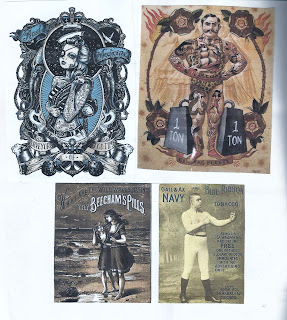
The pictures were of Victorian and Edwardian people - mostly women, covered in tattoos. As seen in previous posts, I knew I wanted my work to be central to women and tattoos - what a great true starting point is this?!
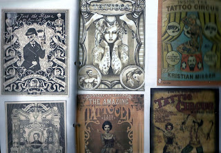
Below are some of the initial images I found and used as inspiration.


While looking online and at my dissertations I came across some images that really caught my eye - and instantly ideas on illustration and how this project could develop started to appear from these images.
The pictures were of Victorian and Edwardian people - mostly women, covered in tattoos. As seen in previous posts, I knew I wanted my work to be central to women and tattoos - what a great true starting point is this?!
Below are some of the initial images I found and used as inspiration.


I really liked these images- the completely spoke to me and inspired a whole new wave of ideas over me. The quality of the images, the ghostly back and white, as well as the youth in the faces and grandeur of the hair and style of the women was all of absolute beauty in my eyes.
Subscribe to:
Posts (Atom)